OVERVIEW
I redesigned Wealthsimple to make investing more accessible and less intimidating. Through research and user testing, I identified key challenges and created a simpler, more intuitive experience that empowers users to take control of their finances.
In a world where financial literacy can feel out of reach for many, I set out to redesign the Wealthsimple app with one goal in mind: to make investing more accessible. The app had usability issues that alienated key demographics, particularly younger users and women. I focused on simplifying navigation, modernizing the interface, and ensuring the app met accessibility standards. By integrating user feedback and industry best practices, the redesign aimed to create an intuitive experience that empowers users to take control of their finances and make informed decisions with confidence.

The current Wealthsimple app fails to meet user expectations, with clunky navigation and redundant pages. How might I re-design Wealthsimple to make it more accessible to underrepresented demographics such as younger people and women?
The redesign aims to enhance the UI/UX of the Wealthsimple app by resolving usability issues. This will create a more accessible and user-friendly platform, growing the user base and reinforcing Wealthsimple's commitment to user empowerment.
By optimizing the user flows and removing redundant features, the updated design enhances accessibility and user experience. These changes made the app intuitive and efficient, increasing the overall user trust and satisfaction.
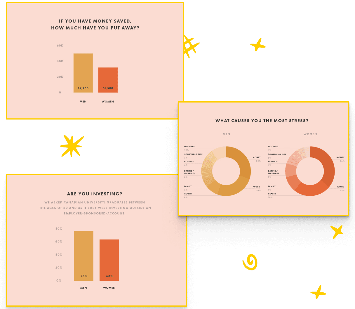
Through in-depth research, I discovered a glaring issue: there was a significant underrepresentation of both women and individuals under 35 in the Wealthsimple user base. Women, in particular, were less likely to use the app than men. I quickly realized that the barriers weren’t just technical—they stemmed from intimidating interfaces and a lack of financial education. The data pointed to an urgent need to simplify the investment process and make it more inclusive, especially for those who may feel excluded from the world of finance.

I chose the Double Diamond design process for this project because it offered a structured yet flexible approach to problem-solving. In the first phase, I focused on discovering the core pain points users experienced—especially around navigation and accessibility. This deep dive into user needs revealed that complexity and unclear guidance were major barriers to engagement. In the second phase, I worked on developing targeted solutions that would directly address these challenges, resulting in a smoother, more intuitive user experience for everyone.

To address the core issue of accessibility in wealth management, I developed personas that represented the most underrepresented demographics in Wealthsimple’s user base. By identifying gaps in adoption among younger adults and women, I based these personas on surveyed individuals who fell into these categories. These personas allowed me to tailor the platform to users who felt underserved by existing financial tools, ensuring that the redesign made investing more intuitive, approachable, and inclusive.

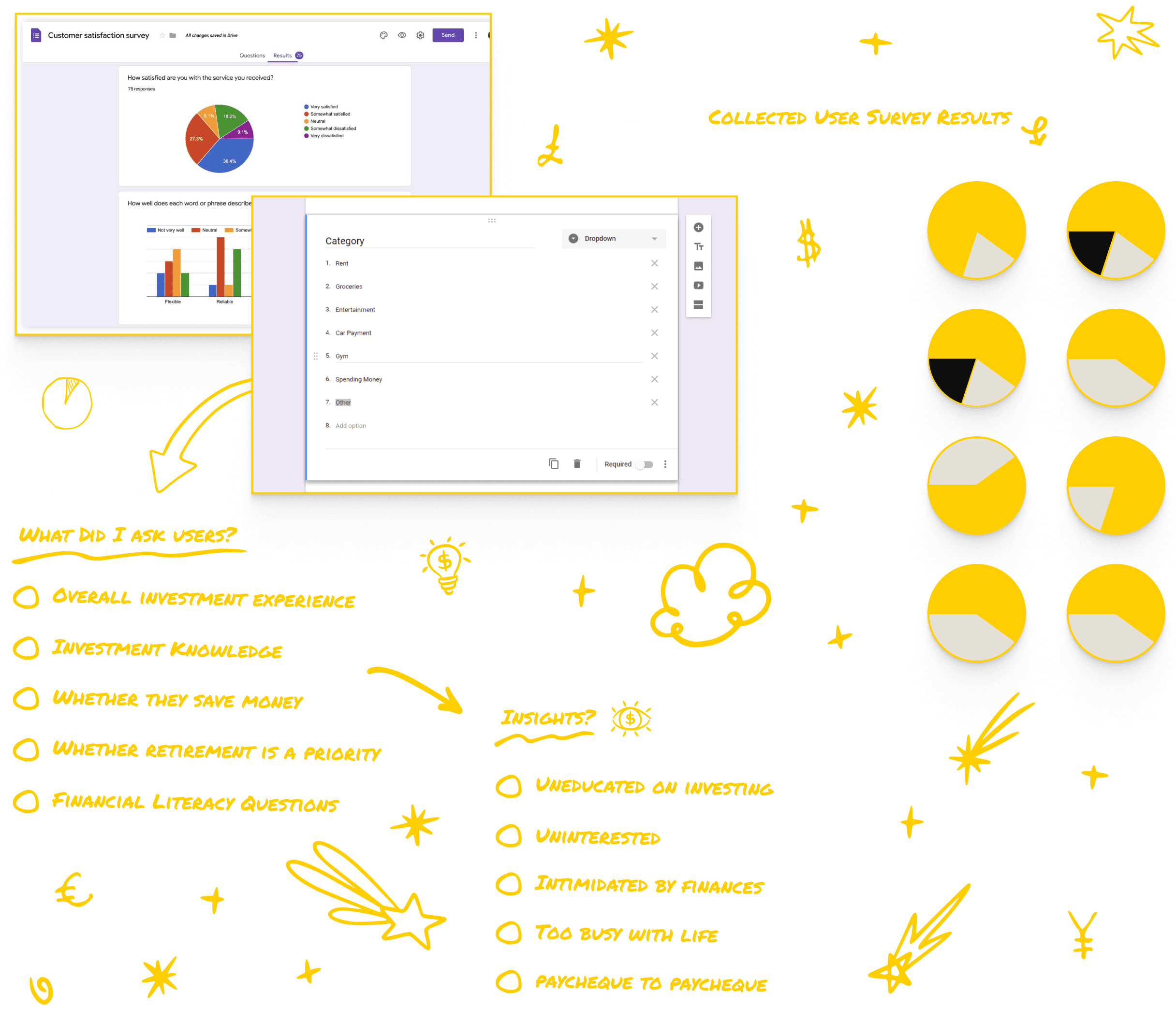
I conducted targeted research by interviewing men and women aged 20 to 50 to understand their motivations and frustrations around investing. Some were active investors, while others had never invested at all. The insights I gathered revealed that for those who were already using the app, usability issues were preventing them from fully engaging. For others, the complexities of investing were simply too intimidating. This research underscored the need for a design that was both welcoming and empowering for all users.
As part of the design process, I asked users to navigate Questrade's app, a direct competitor, to complete similar tasks such as setting up an account and exploring educational resources. The feedback was illuminating: Questrade suffered from many of the same usability issues as Wealthsimple, but its app was even more difficult to navigate. Key features were hidden under layers of menus, and the financial jargon made the app feel inaccessible. Users found the experience frustrating, which highlighted how crucial it was for Wealthsimple to stand out by offering a more streamlined and user-friendly alternative.

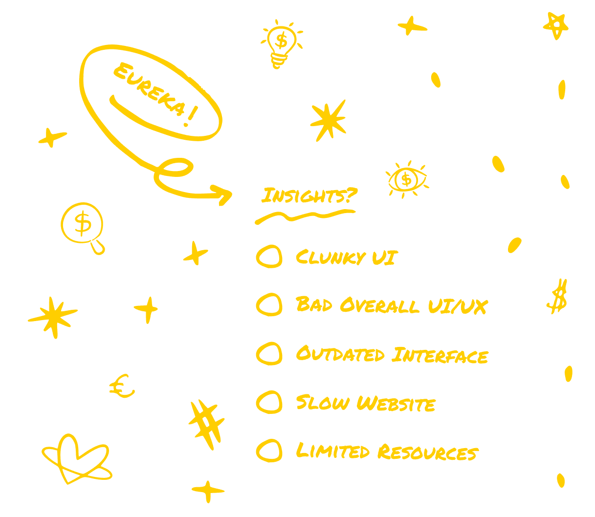
To pinpoint specific usability issues within Wealthsimple, I conducted user testing that focused on essential tasks like account setup and managing deposits. The feedback revealed that the app was unintuitive, particularly for first-time investors or those without a financial background. Complex navigation, a lack of clear guidance, and overwhelming information were all major pain points. This insight helped me identify where to focus my redesign efforts, ensuring the app would be both easier to use and more approachable.

I employed two user-testing methods to refine the design. The Five-Second Test helped evaluate the clarity and immediacy of my design, while A/B Testing allowed me to compare different iterations and choose the most user-friendly version. The feedback from these tests confirmed that users preferred the simplified navigation and streamlined onboarding process. Reducing complexity and eliminating unnecessary steps was key to making the app more accessible.

The original Wealthsimple UI was riddled with usability issues that made it difficult for many potential users to feel confident using the platform. The outdated design was overwhelming, and it discouraged younger people from exploring the world of investing. The experience was not only ineffective but also served to alienate people from gaining the financial literacy they needed to succeed.

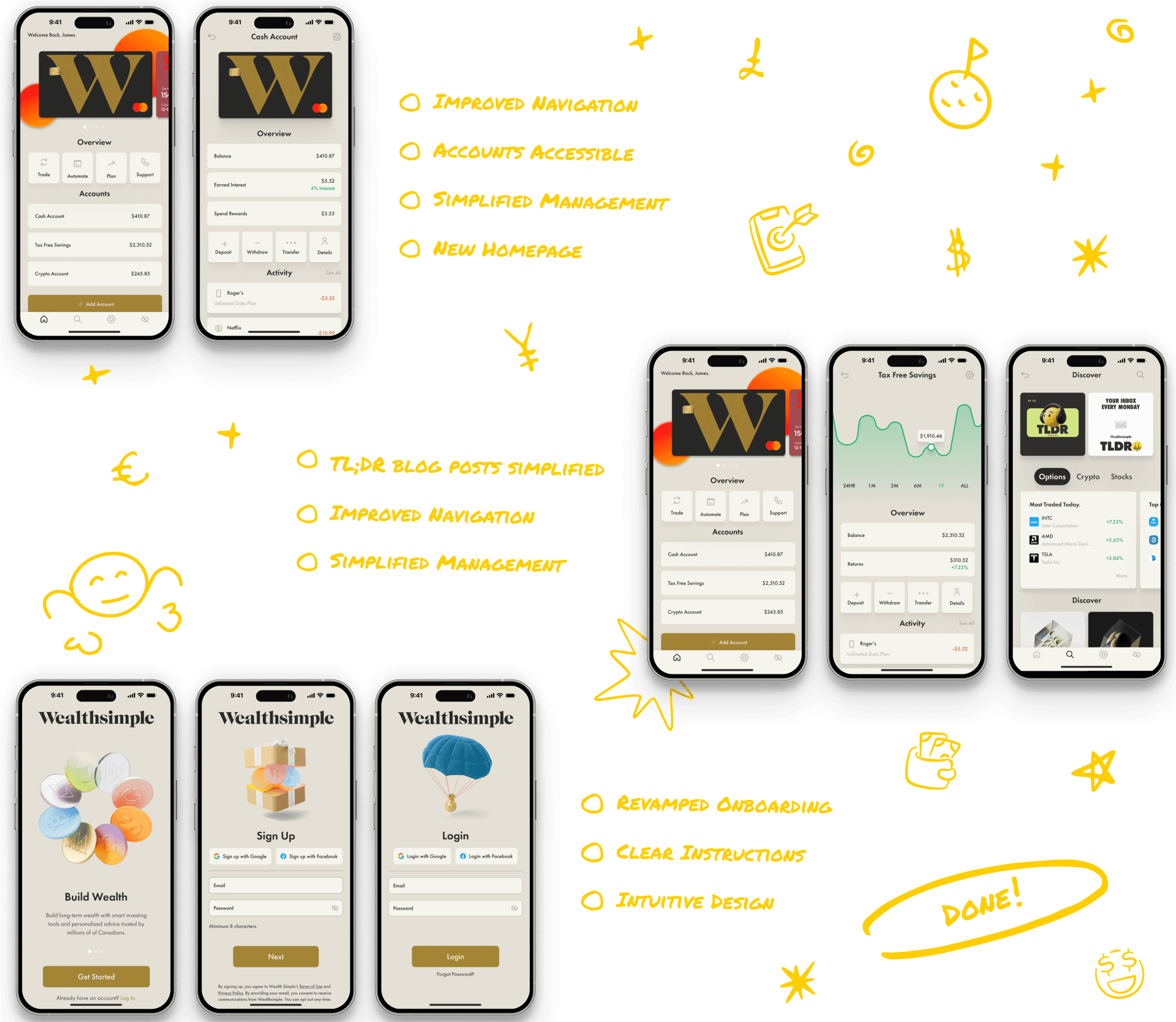
The redesigned UI/UX brought clarity and ease to the Wealthsimple app. The new navigation system simplified onboarding, helping users quickly understand how to get started with investing. By removing the clutter and making key features more accessible, the app now appeals to a broader demographic—particularly younger users and women, who had been historically underrepresented. The design empowers users to take control of their financial futures, encouraging them to engage with investment and financial planning, thus promoting greater financial literacy for all.

CONCLUSION
Redesigning Wealthsimple wasn’t just about making an app look better—it was about making investing feel approachable for everyone. By focusing on simplicity and accessibility, I helped create an experience that empowers users, especially those who’ve felt excluded from financial conversations. The goal was to remove the barriers to investing and give people the confidence to take control of their financial futures.