Type
Case Study
Year
2023
Service
Mobile APP
role
UI/UX & INFORMATION ARCHITECTURE
OVERVIEW
— an optimized real-estate experience
The modern real estate market is saturated with platforms that overwhelm users with excessive listings, inefficient filters, and a lack of contextual insights. This case study explores the design of a user-friendly real estate platform built from the ground up to simplify property searches. By prioritizing intuitive navigation, personalized recommendations, and seamless filtering options, the platform enhances the search experience for younger individuals and families, making it practical, efficient, and visually engaging.
This project focused on designing a real estate search platform tailored for families relocating to New York City. Current platforms often fail to address key usability pain points, such as cumbersome search processes, redundant filtering mechanisms, and information overload. Using a structured user research-driven approach, I developed a streamlined interface with clear information architecture, advanced filters, and location-specific insights. The result? A platform that empowers users to find properties effortlessly while gaining key neighborhood insights.
— PROBLEM STATEMENT
How might I design a platform that simplifies the home search process while offering comprehensive, personalized information to meet the needs of families?
— goals
The goal of this project is to design a real estate platform that simplifies the home search experience for families that avoids the same issues that plague competitors.
— design solutions
Customized recommendations based on user preferences, and filtering tools to refine searches by prioritizing user needs, wants and usability.
Understanding the shortcomings of existing platforms was crucial. My research began with an in-depth analysis of dominant real estate apps, including Zillow and Kijiji. User reviews and discussions on Reddit revealed recurring frustrations, including overloaded interfaces that obscured key property details, ineffective filters that failed to refine search results properly, and a lack of contextual data about neighborhoods and surroundings. These insights validated the need for a streamlined, user-first real estate experience that prioritized ease of navigation and relevant filtering options.


— Design Process
I followed the Double Diamond Design Process to balance research and design exploration. In the discovery phase, I identified usability pain points through competitive analysis and user feedback. The definition phase helped clarify core user needs, emphasizing navigation efficiency, advanced filtering, and tailored recommendations. During development, I created wireframes and iterated on designs through A/B testing and user surveys to validate usability. The final stage focused on refining high-fidelity prototypes to ensure a seamless, user-centric experience. This structured approach ensured that every design decision was backed by data-driven insights and validated through iterative testing.

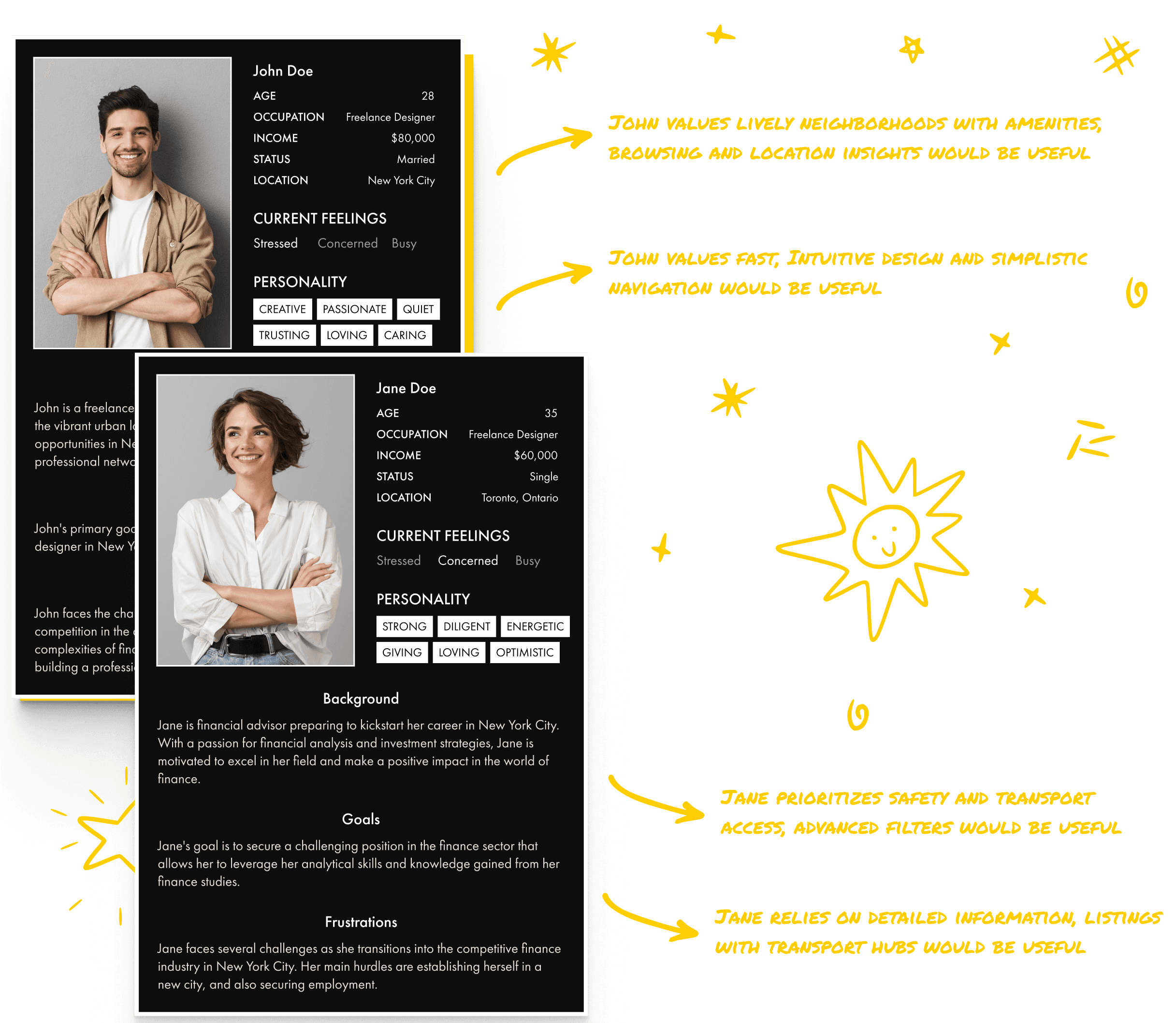
— Persona Spectrum
The persona spectrum focused on a young, relatively affluent couple moving to New York City. Their contrasting needs influenced the design of the platform. One partner prioritized a lively neighborhood with amenities, making location insights a crucial feature, while the other valued efficiency and clarity, emphasizing the need for an intuitive interface with simplified navigation. By balancing these priorities, the platform offered tailored search options that catered to both lifestyle and usability preferences, ensuring a personalized and effective home search experience.
Through extensive research, Zillow and Kijiji emerged as the main competitors in the real estate platform space. Both platforms exhibited significant usability challenges that hindered user satisfaction, including cluttered interfaces, ineffective filters, and excessive ads that disrupted the browsing experience. Neither offered a seamless, criteria-driven search experience, highlighting a clear opportunity to design a solution that prioritized streamlined navigation, comprehensive filters, and rich contextual details tailored to users’ specific priorities.


— User Research
To better understand user frustrations and needs, I conducted usability testing with a group of ten participants. They were tasked with completing navigation exercises and property searches on Zillow and Kijiji. Following this, I distributed surveys to gather detailed feedback about their experiences. Users consistently struggled with complex navigation, redundant filters, and information overload, reinforcing the need for a more intuitive and guided search process.

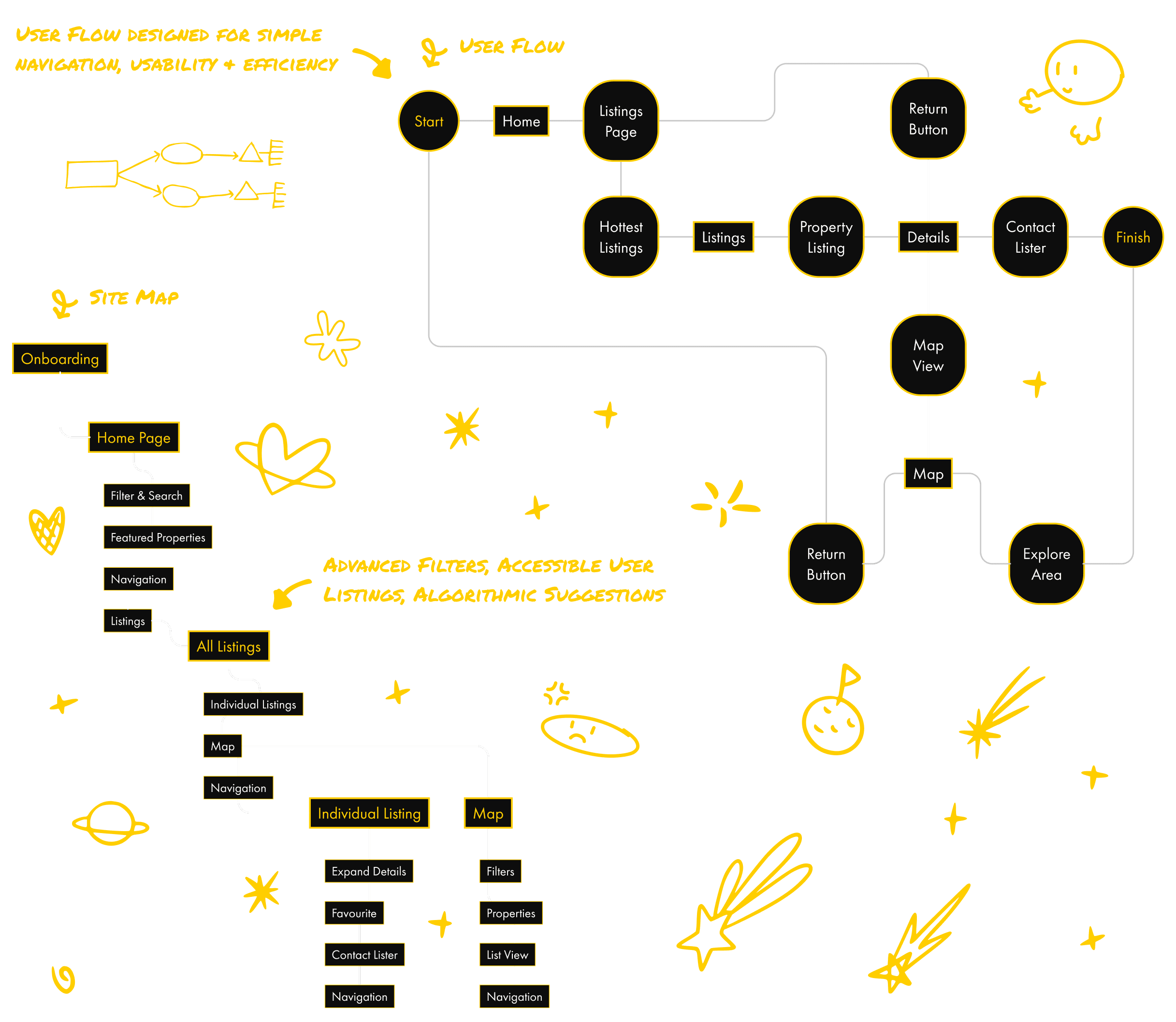
— SITE MAP & USER FLOW
I designed a hybrid navigation system to address the critical usability issues found in competitor platforms. The system supported both browsing and specific, criteria-driven searches. To enhance the user experience, I integrated algorithm-driven suggestions that tailored property recommendations to a user’s previous searches, ensuring efficiency and relevance. By eliminating unnecessary steps, streamlining pathways, and aligning navigation with user behaviors, the platform delivered a seamless and intuitive experience for diverse search needs.
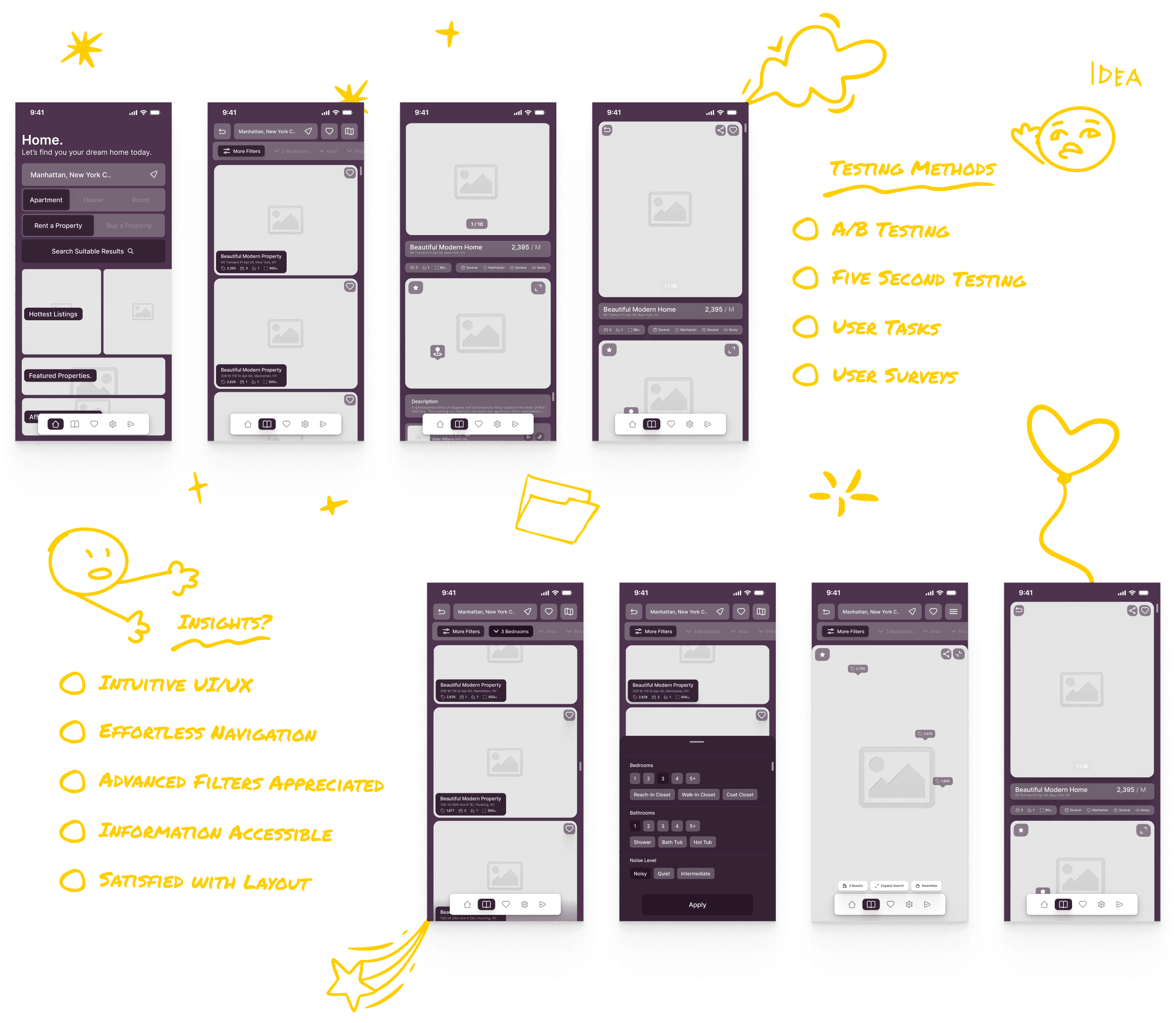
— User Testing
User testing played a key role in validating the platform’s design and refining its features. I used A/B testing to compare variations in filter placement and navigation flows, ensuring that the design met user expectations. Additionally, I applied the five whys method to analyze the root causes of frustrations raised during testing. Surveys provided participants with an opportunity to share feedback, pinpoint usability challenges, and suggest improvements. Users responded positively to the intuitive UI, effortless navigation, and the accessibility of advanced filters. The insights gathered led to refinements that improved overall usability, making the platform more responsive to user needs.
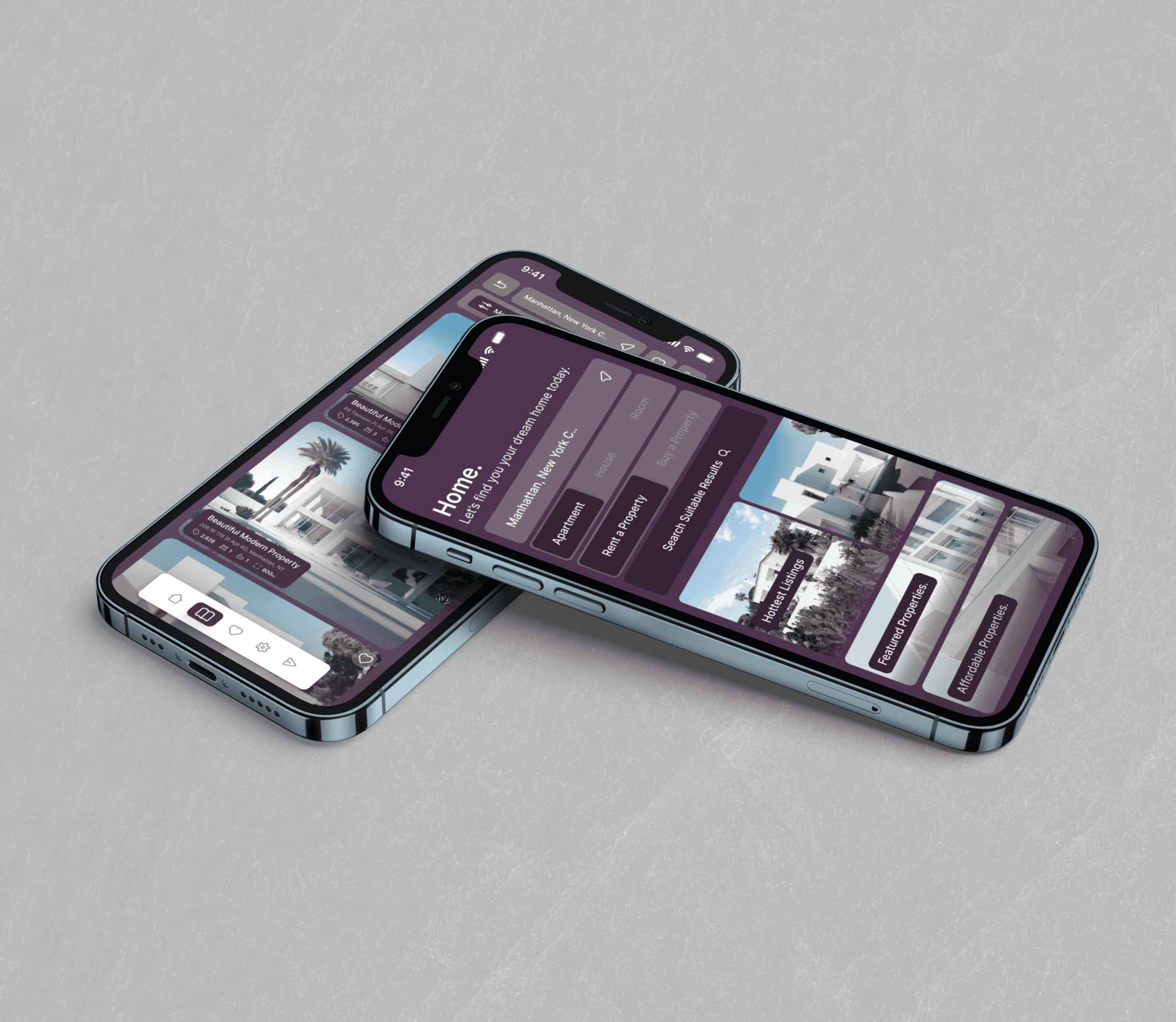
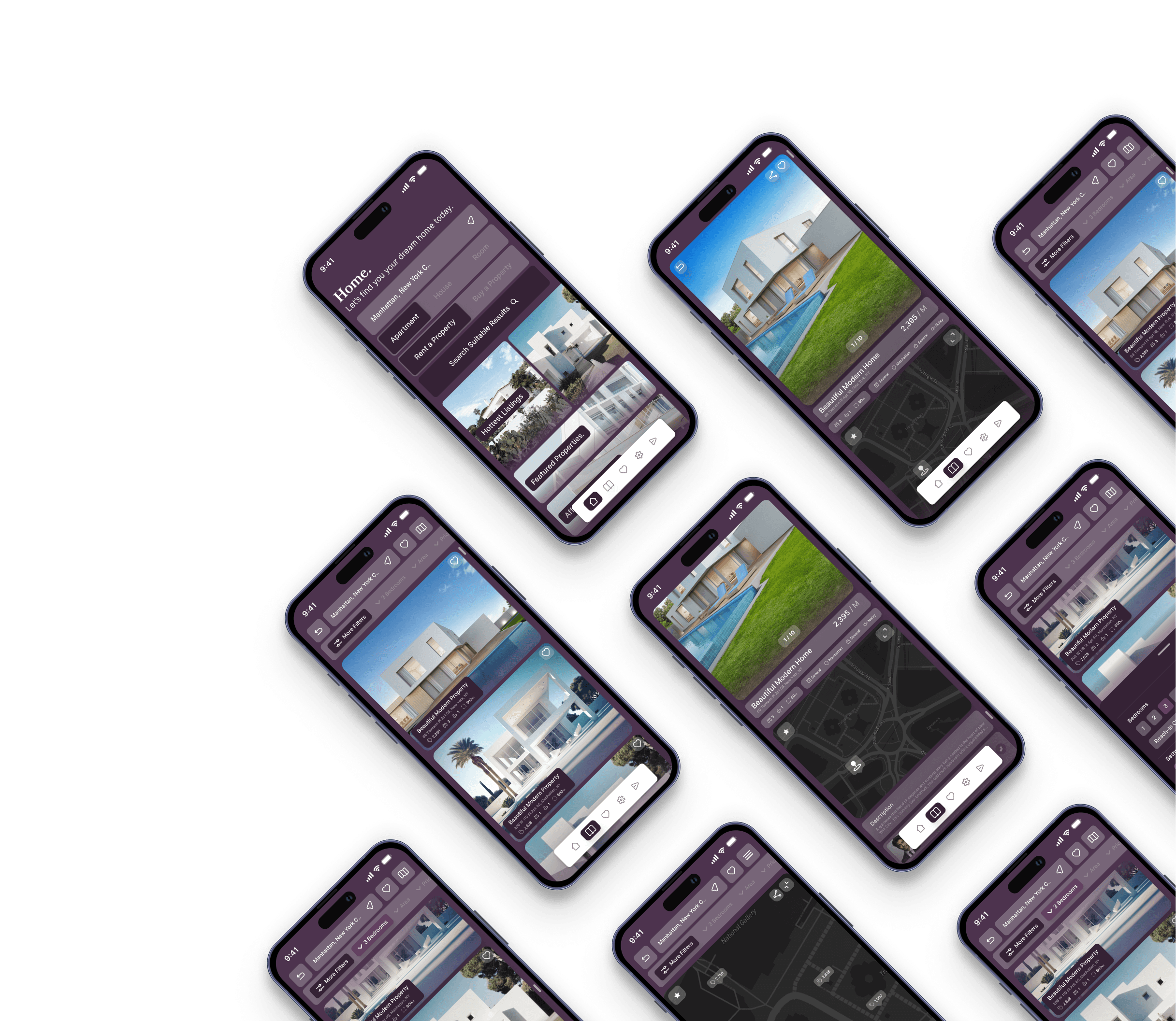
— High Fidelity Screens
The final design successfully addressed the core issues identified in competitor platforms, such as clunky navigation and ineffective filters. By prioritizing intuitive navigation and advanced filtering options, the platform ensured that users could seamlessly search for properties that met both property-specific and neighborhood-specific criteria. Contextual features like noise levels, amenities, and transport access added value, helping users make informed decisions. The improved design provided an easy-to-use interface with algorithmic suggestions, detailed listings, and a visually appealing layout that enhanced the overall search experience.

— final product
CONCLUSION
— what did i LEARN?
I learned how crucial information architecture is to crafting successful digital experiences. Initially, I struggled with simplifying information, but through research and studying other platforms, I refined my approach. This project highlighted the importance of clear communication and user needs, making me more mindful of how information is presented.