OVERVIEW
— Implementing Dark UX Patterns
This case study explores the redesign of Twitter's premium subscription service UX to subtly enhance subscription rates and reduce cancellations using deceptive UX patterns like preselection and Roach Motel.
— Introduction
This case study explores my redesign of Twitter's premium subscription service UX to enhance subscription rates and reduce cancellations. By implementing carefully selected dark UX patterns like preselection and Roach Motel, this project aims to guide user behavior subtly while maintaining an engaging and user-friendly experience.

— PROBLEM STATEMENT
How might I design Twitter's premium subscription UX to subtly increase subscriptions and reduce cancellations using deceptive patterns like preselection and Roach Motel, while balancing ethical concerns around transparency and user autonomy?
— goals
To enhance Twitter’s premium subscription experience by applying deceptive UX patterns to boost subscriptions and reduce cancellations. This approach aims to achieve Twitter's objectives while addressing ethical issues related to user transparency.
— design solutions
Implementing deceptive UX patterns to subtly encourage Twitter premium subscriptions and minimize cancellations. By simplifying the subscription process and emphasizing premium features, the design aims to increase user engagement.
— Background Research
Analyzing Twitter's user demographics revealed a younger, predominantly male audience. With 58.38% of users aged 18–34 and 74.3% identifying as male, Twitter's audience contrasts significantly with platforms like Instagram and LinkedIn. General opinions gathered from various online sources highlighted frustrations with limited features and a lack of perceived value in the premium subscription service, forming the basis for my redesign strategy.


— Design Process
I utilized the Double Diamond Design Process to structure this project. In the Discover phase, I analyzed demographics and user feedback to identify key issues. The Define phase synthesized insights, highlighting user frustrations with the subscription experience. In the Develop phase, I explored solutions, focusing on integrating dark UX patterns to subtly influence user behavior. Finally, in the Deliver phase, I created prototypes and tested them to refine the design.

— User Research
To inform my design process, I collected feedback from current Twitter Premium subscribers. By analyzing user insights, I identified pain points such as difficulty navigating plans, dissatisfaction with premium features, and frustrations with cancellation processes. These findings were integrated into the redesign to address user needs and maximize engagement.

— Persona
Jacob Jensen, a tech-savvy professional in his late 20s, represents a key segment of Twitter's audience. His frustrations with Twitter's feature limitations reflect broader pain points that impact user engagement. Jacob fits well within Twitter's primary demographic of younger, male users, making him an ideal representation for guiding the design strategy and implementing targeted UX solutions.

— Dark UX Patterns
Initially, I considered several dark UX patterns but selected preselection and Roach Motel based on research findings. Preselection works effectively by guiding users toward default, higher-tier options, leveraging user inertia. Roach Motel ensures users remain engaged by making cancellation or exit processes challenging. These patterns were chosen for their ability to subtly drive subscriptions while maintaining a cohesive user experience.

— User Flow
The user flow outlines two paths: one for general navigation to the subscription prompt and another triggered by exceeding the tweet character limit or editing a tweet. Each path highlights the integration of specific dark UX patterns, showing how users are subtly guided toward subscribing while minimizing friction for preferred actions.

— Wireframes and Testing
Using the insights collected, I created low-fidelity wireframes and conducted initial user testing. This included A/B testing to evaluate variations and five-second tests to assess immediate user impressions. Afterward, users completed surveys and provided feedback on pain points and general usability, which informed further refinements to the design.

— High Fidelity Screenflow
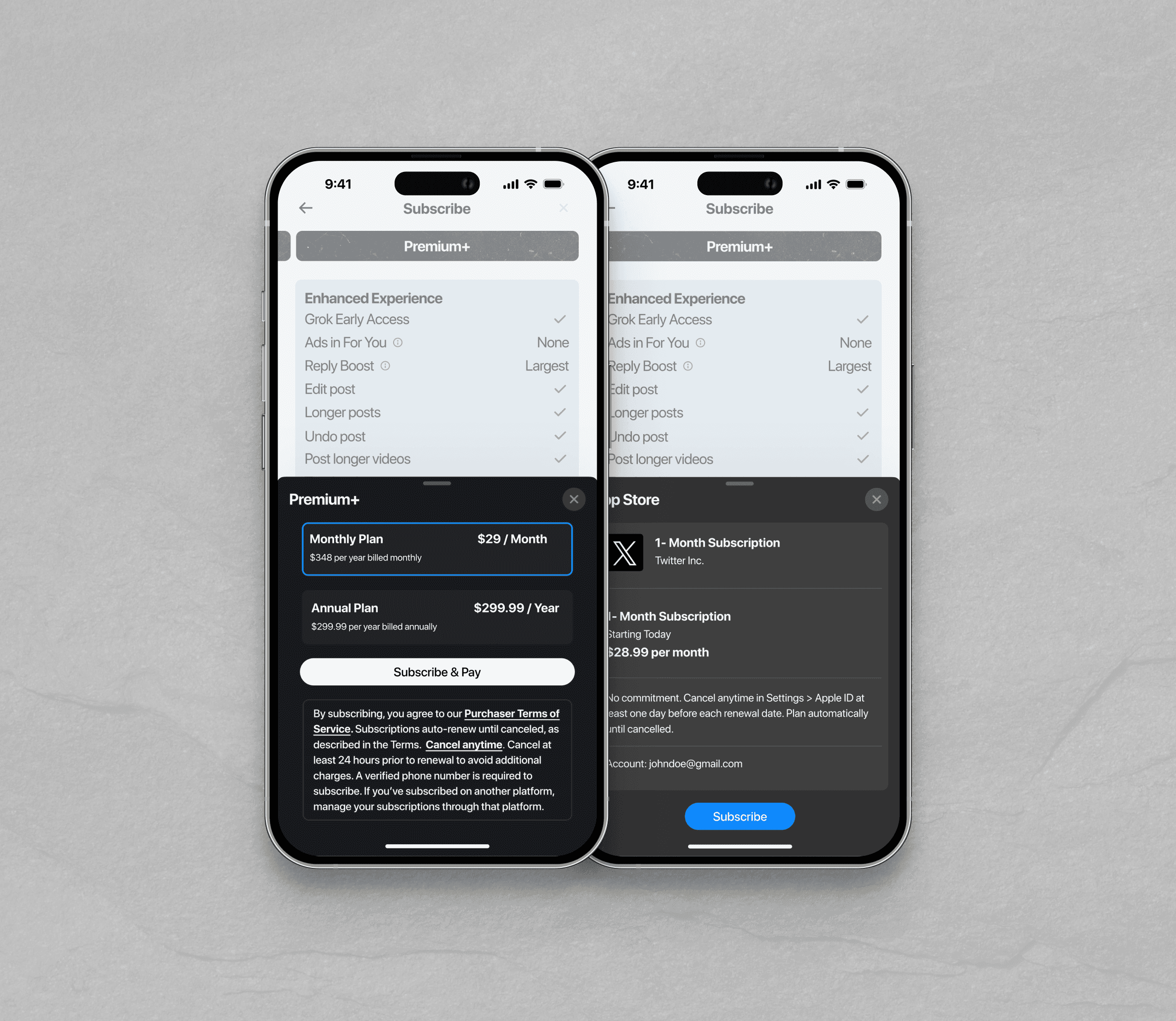
The final product incorporates features like preselection of higher-tier subscriptions, subtle barriers to cancellation, and seamless integration of premium features. These design elements work cohesively to guide users toward subscribing while maintaining a balance between subtle influence and user satisfaction. The redesign effectively addresses user frustrations, boosts engagement, and achieves Twitter's business objectives.

— Final product

CONCLUSION
— what did i accomplish?
By developing a persona for Twitter’s youthful demographic and implementing various user testing methods, I gained valuable insights that informed the design. These changes ensured the service met user needs while balancing effective engagement with ethical considerations.